UI Lab
A Tailwind CSS v4 component library with 40+ themes and 80+ production-ready UI blocks for marketing, application, and commerce interfaces.
Components
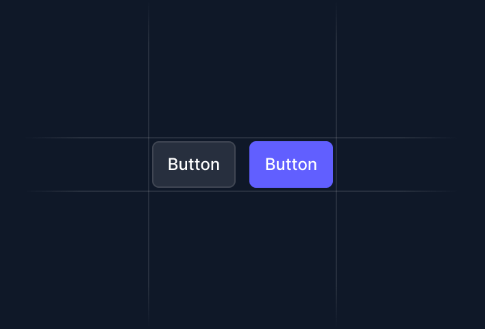
Buttons, forms, cards, alerts, badges, tables — all base UI elements with theme support.
25+ components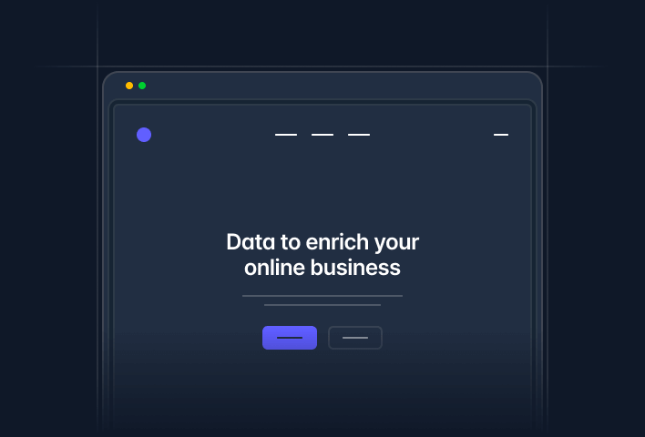
Marketing
Heroes, features, pricing, CTAs, testimonials, headers, and footers.
18+ components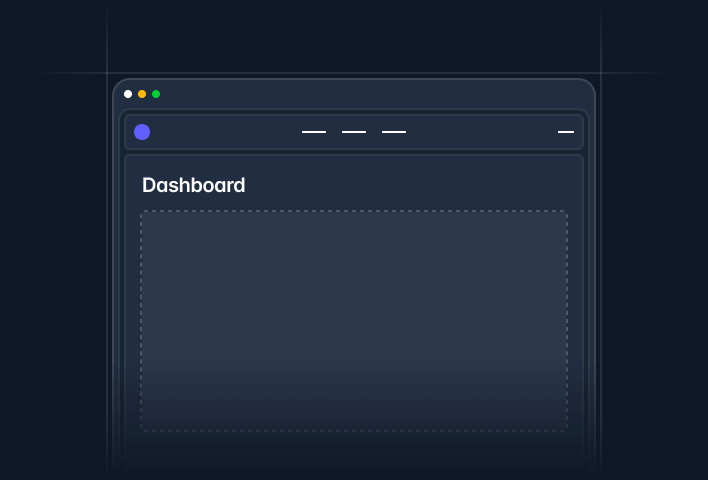
Application
Shells, forms, tables, navigation, overlays, and UI elements.
32+ components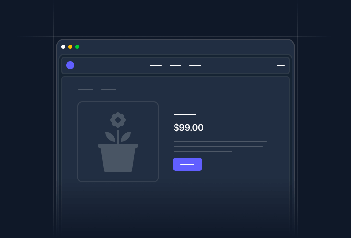
Commerce
Products, categories, cart, checkout, reviews, orders, and promotions.
30+ components
B&W Library
A minimal monochrome design system -- shadcn-inspired, pure Tailwind, zero dependencies.
15+ components40+ Themes
Switch between brand themes (Stripe, Apple, Linear, Vercel), community themes (Catppuccin, Nord, Dracula), and custom Tailwind palettes — all components update instantly.
Browse themes →Built With
- Tailwind CSS v4 + @tailwindcss/vite
- Nuxt 4 + Vue 3
- Headless UI + Heroicons + Ionicons
- Inter font family